Framing
How Shadow Boxes Work: What They Are & Why They’re Used
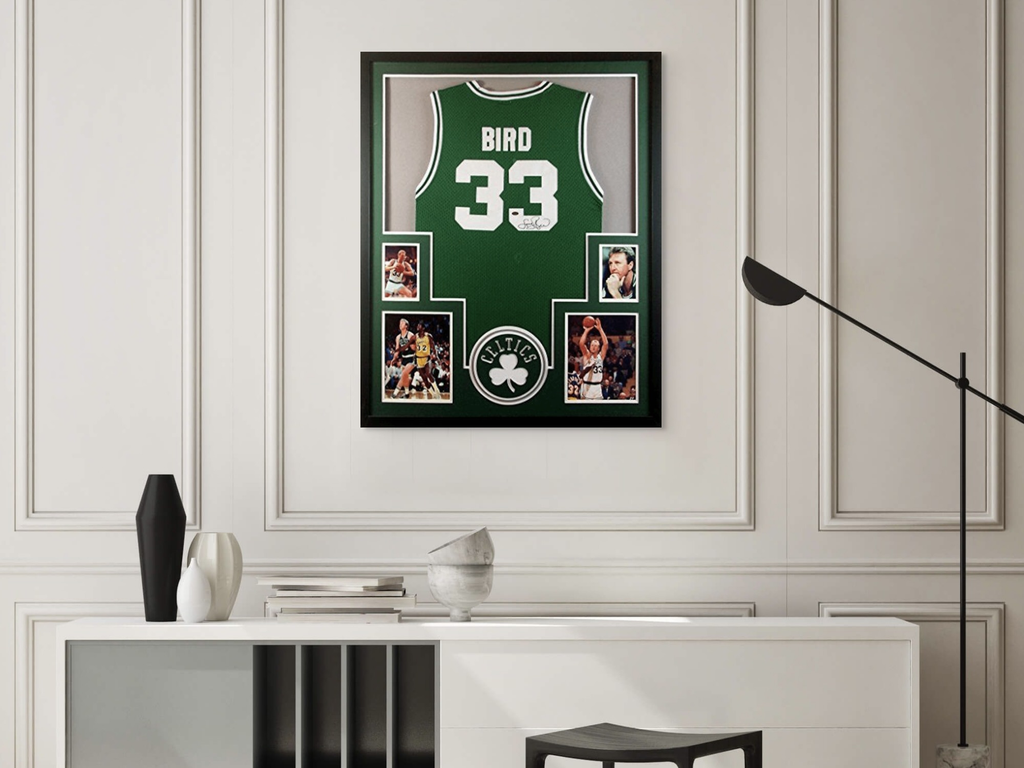
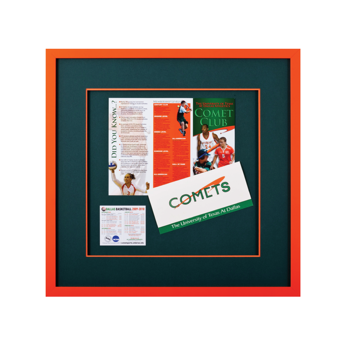
How Shadow Boxes Work: What They Are & Why They’re Used Shadow boxes offer a unique and captivating way to display and preserve memories, collectibles,


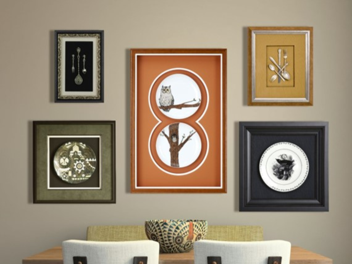
How Shadow Boxes Work: What They Are & Why They’re Used Shadow boxes offer a unique and captivating way to display and preserve memories, collectibles,

How to Wrap a Picture Frame in 7 Simple Steps Kudos to you for creating a thoughtful custom-framed gift to delight a loved one! But

How Big Are Polaroid Pictures? (Photo Sizes) For those of us who adore the nostalgia and charm of instant photography, Polaroid pictures hold a special

